Vincent & Ferrer
Vincent & Ferrer is a new residential property developer in the East of England, devoted to creating high quality, distinctive homes. We have been working with the V&F founder from the early stage of its concept development, helping to define and guide the approach to the brand.
Client
Vincent & Ferrer
Year
2024
Category
Property
Type of Work
Naming
Branding
Logo
Visual Identity
Choosing a company name is a strategic decision that can significantly impact a company's success. It's not just a label; it's a foundational element of the brand that influences perception, marketing effectiveness, legal considerations, and emotional connections with customers.
First Impressions Matter.
The company name is often the first thing potential customers, investors, and partners encounter. It sets the tone and can convey professionalism, creativity, or reliability.
A strong name contributes to a strong brand identity, which helps establish a company's presence in the market.
It then supports brand recognition and recall, informs messaging, improves SEO, fosters trust and imply quality.
The name Vincent & Ferrer stems from the foundations of the built environment process.
Historically, St. Vincent Ferrer is the patron saint of builders.
While not a bricklayer, this connection adds instant gravitas, setting the company apart in the property sector.
By adapting this to 'Vincent & Ferrer Homes', the name sets a standard and expectation that resonates with its target audience.
It also lends itself to the shorter 'V&F', which will become useful as the brand gains market recognition and presence.
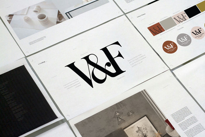
We carefully crafted a bespoke mark from the brand font, with engineered spacing and seamless joins.

Sleek and clean, the V&F identity is based around hero imagery at its core. From considered and beautifully lit interior photography to a distinctive location photography style, purposely curated to create an elevated brand ecosystem.

Of course a brand for a property developer would simply not work without considering how it flexes on the essentials tools of the trade.
Here we rely on the colour palette and focus on clarity. Too often does a brand start to loose recognition and visibility by over complicated design styles on physical surfaces.


